Website template revised Posted on February 4th, 2012 by

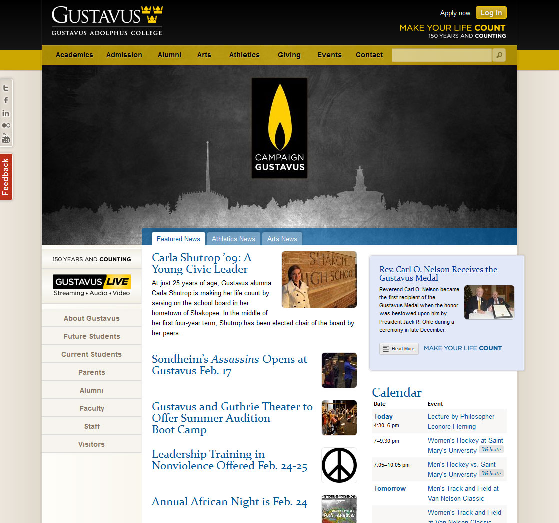
You may notice that the website looks a bit different today. We changed a few things to increase performance and bring more content to the surface. Visually, we preserved the general look and layout, but we’re now controlling it with CSS instead of relying on image files.

The most noticeable changes include the larger banner photos and the navigation sub-menus. We made the masthead area shorter to accommodate the enlarged banners, and we’re utilizing sub-menus to include all sorts of links, calendar events, and images. We hope these updates, in particular, help showcase the amazing work all of you are doing at Gustavus.

We encourage you to take a look and let us know if you see any issues or areas in need of improvement. We’re always looking for feedback and ideas, so please don’t be shy.

While these updates are truly the result of team effort, I’d be remiss if I didn’t single out Joe Lencioni for his excellent work, and the rest of the team for their invaluable support. Special thanks to Tim Kennedy and our friends in the Marketing and Communication office for the ongoing collaboration.


5 Comments

  1. Jeremy Carlson says:

    Great work guys! I especially like the variety of information available in the sub-menus. It’s obvious that this change was well thought out and expertly executed.

    Keep it up!

  2. josephalbert says:

    Great Work team Members

  3. Erik Hagen says:

    Brilliant work. I’ve been impressed with the recent changes to your site, particularly the use of CSS and subtle interaction behaviors.

    What made you decide to add the navigation sub-menus? We’ve had them for years (a so-called “mega menu”) but lately I’ve been considering dropping it, or substantially reducing it based on click tracking results and the complexity of making it work well in tablets and phones.

    Also, are you using a CMS or is it home grown?

    Erik
    Cal Lutheran

  4. Jerry Nowell says:

    Thanks, Erik. I believe our main motivations were simply to highlight certain pages and events that were somewhat buried, and bury some items that were too prominent (cluttering up the homepage). We shared some of your concerns, so we tried to make it a destination (with upcoming calendar events) in addition to a navigational element. It’s definitely not a perfect solution, but in context of our particular situation, it has worked wonderfully. Let us know what you decide to do with your menus. We’d be curious to see how it turns out!