New Colors Posted on September 15th, 2010 by

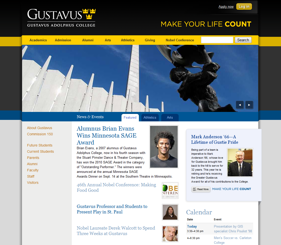
The Gustavus homepage's new colors

The Gustavus website just got a new paint job. Gold and blue were chosen to better highlight our school colors (black and gold) and emphasize our Swedish heritage. With our sesquicentennial approaching, it seemed like perfect timing.

This update also brings a small but nice additional feature for those of you running Webkit-based browsers (like Chrome) or the Firefox 4 beta–the global and local navigation links on each page have a nice short transition that smooths out the differences between the hovered state and the non-hovered state.

We think the new colors brighten up the website and make it feel a bit more lively. We hope you enjoy these changes.


9 Comments

  1. Braden Rogness says:

    Looks nice guys. As usual 🙂 And the css transitions are pretty sweet.

  2. Chris Duhaime says:

    Nice work web team! I like the rollovers… now, can we get the admission page to match?

  3. Jake says:

    Thank you!

  4. Steve says:

    I disagree, our colors are black and gold, not blue and yellow. If we want to seriously emphasize our Swedish heritage, I can think of better ways of achieving that end other than simply using Swedish colors on our webpage. This new color scheme isn’t that great, in fact, our original color scheme was much better. I hope that it will change back.

    • Joe Lencioni says:

      Thanks for the comments, Steve.

      Before this change, since October 2009, our predominant color scheme was orange and teal on the homepage and orange and green on interior pages. Before that, since around May 2006, we were working with gold and blue on the homepage. Before that, our homepage was predominantly blue.

      The new colors on the Gustavus website come from the College’s official graphic standards and are the same colors that are used for all Gustavus communication. Furthermore, they feature our school colors (black and gold) much more than the previous version (orange and teal/green), and to me, seem more in line with the history of the colors of the Gustavus website–for whatever that’s worth. In fact, the yellow on our website is the College’s official gold. Color preference is quite subjective, so it is tough (if not impossible) to please everybody.

      As to emphasizing our Swedish heritage, I’d love to hear your ideas. We are always looking for ways to improve the Gustavus website and are always interested in new ideas.

  5. Ali says:

    I really loved the website before! I also hope that it will be changed back. If you would like a student’s perspective, everyone I’ve talked to has said that the new color (the blue) looks odd and out of place. The website is everyone’s first impression of Gustavus, and I would hate for that to be tarnished by an out-of-place color choice.

    • Joe Lencioni says:

      Thanks for the feedback, Ali–we always love students’ perspectives.

      The truth is, every time we make a big change to the website, we receive a lot of similar negative feedback–the nice version is roughly “I don’t like it, please change it back.” Think about whenever Facebook changes anything, it seems that a lot of people get upset and join a group to bring back the old Facebook.

      When we put the last website design live, we actually received much more negative feedback than when we changed the colors this time. People seem to have adjusted to that change eventually.

      While I’m not saying that this is the case, but it might be that you prefer the previous colors because that is what you are accustomed to seeing–if it was your first impression of the website, you might have a different opinion. Give it some time and let it sink in for a while. You might come to like the new colors.

      If you have any more feedback about the website, please let us know. We are always looking for ways to make it better. Thanks again!

  6. Kristin says:

    I like the color scheme and the website looks nice. You should downplay the “Make Your Life Count” part and I would actually be proud to go to this school. I’m really not a fan of the slogan because it is horribly pretentious and, not exaggerating, I would not have even applied to Gustavus if that had been the slogan at the time. I know you didn’t make the slogan, but I really hate it and would rather it not be the first thing you see when you go to the website. I also know I’m not the only one who feels this way, so if there is anything you can do (maybe reduce the font size or move it somewhere less conspicuous), I personally would feel better about our school’s image. Now if only we can get them to take down the giant “Make Your Life Count” billboards.