Entries tagged with ‘usability’
The Fold is a Myth
When designing your website, it is easy to get distracted by the unimportant details. One that keeps popping up is the idea of "the fold" and that content must appear above this imaginary line. Why is the fold an unimportant detail? Because it doesn't exist. At least not how you think it might.
9 Easy Tips for Effective Gustavus Websites
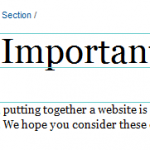
For most people, putting together a website is a pretty big project; putting together an effective website can be a Herculean effort. We hope you consider these easy tips to make sure all of your effort is focused where it counts.
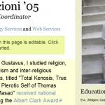
Profiles Are Now Easier to Update
We recently overhauled the mechanism that employees use to update their professional profiles, making them more powerful and easier to use.
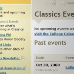
Local Navigation Context Clues
If you've been paying close attention to the Gustavus website over the weekend, you've probably noticed that we added a subtle but helpful new feature to the Gustavus Template. Now, each page's local navigation will highlight the page you are currently viewing if it happens to appear in the local navigation. For instance, check out the Classics Events page.
Text input example text with jQuery
When filling out a form on the web, it isn’t always crystal clear what you are supposed to type into every text input field. Since a confusing form is a form that is less likely to be completed, it is critical to provide help wherever important. In these cases, it can be very helpful to […]
ColorFlashing with jQuery Enchant
Widgets, buttons, and doodads are always vying for one's attention. So, if something is very important, what options does a developer have that will effectively and unobtrusively grab the user's focus?
Gustavus Website Updates
We’ve made some noticeable modifications to the Gustavus template recently. The changes were made to address various minor issues, the foremost being usability problems in the “seach/go quickly to…” area of the header. Simple, comprehensive searching Where once we had a “go quickly to…” menu, search box, and search menu, we now have one simple […]
Linking in Style… CSS3 Selectors for the Win
Today, we made a couple subtle but visually helpful additions to hyperlink styles in our site-wide CSS. We used some advanced features of CSS3 to isolate off-site links, to add an extra background image and padding to the link, based on how MediaWiki handles off-site links. We also added a mail icon to mailto: e-mail […]
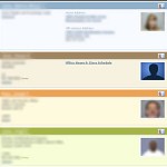
Gribly Gets New Feathers
Last week, we put live a slightly upgraded version of the Gribly with some extra color coding (among other features) that should help visitors parse information more quickly and efficiently. Finding a particular faculty member with the last name “Smith” among a sea of students, administrators, and support staff with the same surname should become […]

More Usable Contact Form
In celebration of World Usability Day we re-designed Technology Services’ contact form. How is this better? The new design divides the form into two logical sections to help visitors input their information as quickly as possible. It also sports a larger text box for visitors to type their concerns. Additionally, the form now will remember […]