We upgraded our File Not Found Error 404 page today. This upgrade offers three exciting improvements that should help to eliminate confusion, calm nerves, and, in the end, improve the Gustavus website.
Here’s a rundown of the three most significant new features:
1. Friendlier, more helpful error message
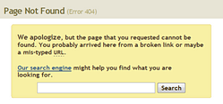
We re-examined the text of the message on our error page because we wanted to make it as friendly and helpful as possible. The new copy eliminates redundancy, offers suggestions as to what may have gone wrong, and provides a search box—a helpful next step and a positive alternative to leaving our site or closing the browser.
The text is also larger and highlighted from the rest of the content on the page, which helps set it apart.
2. Recent popular searches
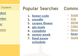
If you are lost on our website, there is a good chance that you are looking for something that someone else has already looked for. If this is the case, then the new list of recent popular searches might save you a lot of time and frustration.
You are now one quick click away from search results for the top seven most popular search terms on the Gustavus website.
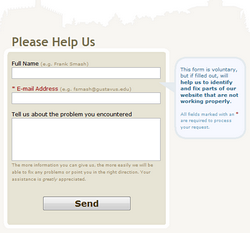
3. Faster, easier to use error submission form

One of the most helpful features for us—and the feature that is primarily responsible for broken things getting fixed—is the error submission form at the bottom of the error page. That’s why we decided to pay special attention to this portion of the error page.
Creating concise, easy-to-use, and effective web forms is truly a delicate art-form. When we were evaluating our previous error reporting form, we realized that there were a number of improvements that we could make that would make the form not only easier on the eyes, but also easier to use.
First, we moved the labels for the form elements from the side to be directly above the form fields because people can understand them up to ten times faster than our previous configuration. Second, we added language explaining what we find helpful in error reports. We hope this will encourage people to tell us as much about the situation they have encountered as possible. And, finally, we put some form description text in a friendly and attractive little blue bubble to the side, in a similar way to what we have done in other areas recently, such as the Submit Your News form and the Senior Class Gift website.
But wait, there’s more
We have also designed this error form to be flexible enough so that it may serve as the foundation for other errors on our website such as the 403 Forbidden error and the 500 Internal Server error. What this means is that for an increasing number of situations when something goes wrong, you’ll be presented with a familiar style of information and familiar options to help you figure out what happened and what you can do to help fix any problems.
If you’d like to take a look at our new error page, try going to any page on our website that doesn’t exist. After that, let us know what you think.